Man, it's been a while!
Work has been pretty crazy busy, limiting me to eating and sleeping in my freetime!
Though I have been squeezing in a few projects on the side.
Here's an interesting one. It's always entertaining when you get very little in terms of direction from a client. For this music venue/night club called The Venue On Park Avenue, the following photos and the description, "young but retro, with a coastal vibe" were all I got.


Anyway, I went through a lot of different ideas and options, trying all kinds of retro-ish things. And a lot of them really looked decent....Until they were put on the wall of the
really good looking and attractive building.
It was then that I realized that the only thing I really COULD do would be to use the angles and shapes of the building itself to have a good say in the shape of the logo.

This is what i came up with

I took the exact angles of the ‘V’ on the facade and used that for the mark, and doubled it over to create the ‘notches’ on top. This created a very young and modern mark that fit well on the wall. I tried to balance this youthfulness with a type treatment to the name of the establishment. The font (kabel) is a throwback to that era and fits the mark very nicely.
On the exterior of the building, the mark sits beautifully, accenting the building instead of masking it. It adds a kick of youth without stepping too far over any lines.

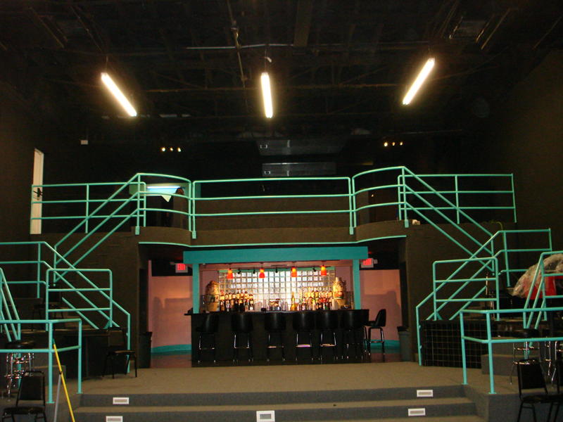
Inside, the mark becomes a different character, adding energy and dynamic to the space.
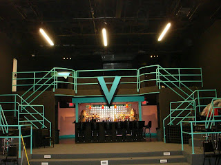

The ‘V’ is not just the first letter of the name. It is also symbolic. When I hear the word ‘venue’, I think of a place where things are happening. It’s a place where people gather. It’s happening RIGHT HERE.
That’s what the V is doing.
It’s pointing.
It’s saying “Here is where it’s happening.”
Anyway, that's about it. Unfortunately the mark never got used, but it was a fun little brain-teaser.
I will upload more recent work here soon.